Every semester I teach a class called internet design I open by asking the students about their internet habits. Recently I asked a class of around twenty: How many of you have used the internet already today? All of them raised their hands. How many of you have read the newspaper in the past few weeks? Only two. How many of you have gone to the cinema in the past month? Three students. How many of you have watched a film? (of course this was a trick question) Nearly everyone raised his or her hand. Was is a downloaded copy? Everyone giggled sheepishly.
This, of course, is not new. By and large, accessibility wins out over quality hands down. Whether it be locally made solid-wood picnic chairs versus flatpack MDF laminate or fake ipods purchased on Trademe versus the authentic product; accessibility or lack-thereof suggests a deal. Often the deal brings with it a list of foibles; it is thrown away when a part is lost, it is not as easy to use, there is pixelation or a tinniness in the sound. Our choices depend heavily on how much quality we are willing to sacrifice to accessibility. Having an item satiates our need for the item. On a grand scale viewers suggest that they are more than happy to sit through questionable quality to get the result they desire; collectively we’ve lowered the bar.
What does this mean for graphic design? Design has always been populated with the novice and the professional; often born of necessity. Melting into the everyday visual landscape, design it is not a genre unto itself but rather a support to a variety of media and genres; part colour, part trend, part throwback, part idealistic, part sexy, part visual, part necessity, part promotion and part communication. After years of Arial and Times New Roman, the last upgrade of Microsoft Word set a typeface called Cambria as the default. Even typography purists agreed that it was a beautiful default. Now café owners who create and print their own menus start from an aesthetically pleasing generic, a step beyond where they were a few years ago.
Novice designers share the same impetus and starting point as us; a problem in communication exists and their attempts are to fill the void between service and client. A virtual number 8 wire, some people would call this free design innovation; available technology allowing users the ability to create and to solve their own design problems. If having a vegetable garden in the backyard is one step closer to independence, then DIY design is too. Inevitably user-centred design will bring more humans into our ranks. In the future they will not come to the design table empty handed, but rather knowledgeable. They will have used downloaded vector artwork and free high-resolution stock photography or taken their own. They will have banged out a selection of words (their logo) in various typefaces and somehow decided that one in particular reflects the guts of their organisation. They will have used beautiful blog themes downloaded over a hundred-thousand times and populate the theme with their own content. They will use templates in programs such as Word with undeniable success.
Without perhaps realising it, these moments of free design will allow them to customise their online and offline experience and make it their own. The content and decisions made will drive their feeling of ownership. What we offer them is an extension of this, it is our contribution.
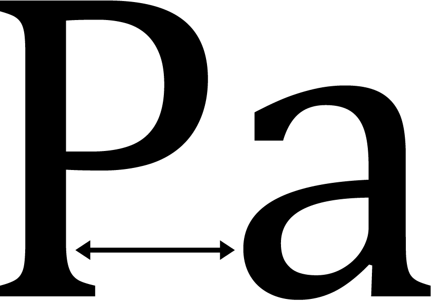
In a critiquing session last week, two letters sitting side by side aptly demonstrated design’s struggle against design’s generic offering. Students were asked in a typography exercise to layout text for a fictional Pacific Island organization. They generated narratives about beautiful beaches, concern about retaining culture and looked into efforts to maintain language. Having researched into regional economics, they made sketches, chose appropriately robust and sensitive typefaces and laid out an assortment of trials and tests. The best software could not fill the hole between the capital and the lowercase. Even Cambria couldn’t help the gap between the ‘P’ and the ‘a’.
It needed kerning.
/// as posted on Design Assembly

