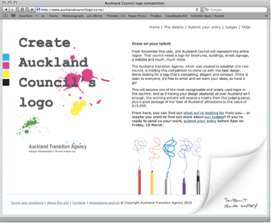
Because I just moved from New Zealand back to Belgium* I’ve missed what I can only imagine was a grand unveiling of the Auckland super city logo competition, much to the shock and horror of designers from the Far North to Invercargill. No doubt cries of ‘bang-for-buck’ and ’say to no to spec-work’ were bantered about, along with a considerable amount of cries of, ‘cool’. Indeed, my first chance encounter of the competition was an email from Louise asking if anyone wanted to tackle the subject in an article; my gut response was to attempt to find some positive takes on what I could only imagine to be the less favourable side of the coin: pro-community.
In a very poignant and timely press release, DINZ spoke really eloquently on our behalf. To summarise, it highlights the lack of consultation from the design community in regards to the competition itself, the lack of involvement of designers on the judging panel(!) and it discusses how the competition undermines the value of a strategic branding design process.
Interestingly enough, save this professional validation and the economics of such a big job in the capital of New Zealand’s creative community, we, as a collective probably wouldn’t ordinarily have such an issue with requesting real and honest creative input from the community. However this particular initiative feels both manipulative and tender.
As designers it’s easy for us to see the mechanics at work on both sides. There’s no real way to hide the fact that at its heart, this competition is part of a strategy to get locals to buy in to the super city concept. You can almost imagine the pitch in the suit, “If you get them to feel that they’ve helped create the look/feel… if you get them thinking about what the city means to them, they’ll feel more connected to the city and really take ownership.” On the other hand, this competition is one of many exercises to find out something real and beautiful, something we really respect as apart of contemporary design’s ethos; how Aucklanders define Auckland.
When New Zealanders around the country begin thinking of their neighborhood fitting into the city fitting into the region fitting into the nation, they’ll be thinking about it just like designers do. They’ll think in words, images, relationships and colours. There are few people who will read or hear about the call for entries who won’t stop for a second and think in design. Perhaps they’ll think more critically of their own town’s identity. Perhaps after they read the newspaper article, they’ll joke with a friend about how to symbolize Auckland without being cliche. Maybe they’re so familiar with the shape of Highway 1 that in their mind it becomes a line instead of a road.
These are each design processes that we, as designers, use readily. Each example is a nugget of ideas that can grow into substantial motifs. Although we’d like to sometimes pretend that these processes are exclusive to us as designers, they are actually open-source and applicable to any number of scenarios.
The greatest problem with the logo competition is not that the community is involved, but that we were not involved with the decision on how to involve and interact with the community. What’s done is done. Perhaps we should begin thinking of it now as 4 million or so people thinking about design. Maybe we should spare a thought for all of the school kids that will encounter this design problem as one of their assignments and maybe make a logo-toolkit for their teachers to use. Perhaps we should consider the people who doodle on napkins. (Designers sometimes do that as well!) Besides, even if you don’t want to admit it at the moment, a lot of us will put our designs in too. We’ll just be designing as part of the community instead of designing solely for it.
*Don’t worry, as everyone seems to ask, we’re permanent residents, so the “inevitable” move back to New Zealand will be an easy and painless process!
———-
On a different note, in regards to the design of the competition’s website, I can only hope that the use of a stock image of pens and scribbles (istockphoto file#: 1304229) and free vector ink splatter was ironic, when the competition uses phrases such as original and genuine.
/// as posted on Design Assembly


